An intra-organisation travel application.
Based on their roles, the app enables employees, to achieve the following:
Create travel requests
Manage bookings and services
Receive approvals and updates
Check their travel itinerary
Connect with travel agents

Project Info.
Role
As a User Experience (UX) Designer on the project I was responsible for user research and analysis, design of flows, interface and interactions.
I was also performing the UX Writing for the app. I had to work on the language i.e. terminology and tone, as per the screen states.
Design Process
The process broadly involved the following stages:
Research, Analysis, Ideation, Concepts(Prototypes), Testing, Iteration
The project followed an Agile methodology within a cross-geo team, and maintaining a constant connect with the Product Manager, Business Analyst, UI designer and Developers on the team.
The project followed an Agile methodology within a cross-geo team, and maintaining a constant connect with the Product Manager, Business Analyst, UI designer and Developers on the team.
Phase 1
Phase 1
Based on discussions with stakeholders, the team started with re-design of the desktop web-application.
The user interviews indicated many pain points, and the key areas for improvement included:
- Application needs to be easier to use
- Workflow simplification, lengths and consistency
- Introducing familiar terminologies and graphical elements
- User-role prioritisation and FAQs
- Offer a companion mobile app
- Speed of the application, to be increased
- Accuracy in search and filtering
The application included 4 type of users-roles:
- Employee
- Manager
- Visa Agent
- Travel Agent
Based on discussions with stakeholders, the team started with re-design of the desktop web-application.
The user interviews indicated many pain points, and the key areas for improvement included:
- Application needs to be easier to use
- Workflow simplification,lengths and consistency
- Introducing familiar terminologies and graphical elements
- User-role prioritisation and FAQs
- Offer a companion mobile app
- Speed of the application, to be increased
- Accuracy in search and filtering
The application included 4 type of users-roles:
- Employee
- Manager
- Visa Agent
- Travel Agent
The personas created for employees:
Employee
Manager
Travel Agent
The information architecture for Phase 1, as per the user roles are given below.
The information architecture for Phase 1, as per the user roles are given below.
Employee
Manager
Travel Agent
The Trip creation and Approval flow was established.
The Trip creation and Approval flow was established.
The Task Flows were defined.
All Roles
The Task Flows were defined.
Few views of the older travel application


Few views of the older travel application


A sample of Wireframes from Phase 1.
A sample of Wireframes from Phase 1.
Trip Creation - Return Trip 1

Trip Creation - Return Trip 2

Trip Creation - Multi City Trip

Iterations - Trip Creation with Responsive Layouts


Mobile


Mobile Wireframes


Views from the UI Designer


Views from the UI Designer


Emailer created with the team's UI designer

Emailer created with team's UI designer

Emailer created with team's UI designer

Phase 2
Phase 2
With the onset of this phase, work on Desktop version was put on hold, and the focus shifted to the companion mobile app. The shift was made to provide an increased value to the traveller, by allowing priority access of the trip details and itinerary. Travel bookings, as was decided, would happen on the Desktop web-app. The companion mobile app was to provide primarily a read-only support during travel.
With the onset of this phase, work on Desktop version was put on hold, and the focus shifted to the companion mobile app. The shift was made to provide an increased value to the traveller, by allowing priority access of the trip details and itinerary. Travel bookings, as was decided, would happen on the Desktop web-app. The companion mobile app was to provide primarily a read-only support during travel.
The information architecture for Phase 2.
The information architecture for Phase 2.
Page Focus
During Phase 2, a small study was done for the mobile views.
During Phase 2, a small study was done for the mobile views.
Study on mobile views


Through this phase, new changes were incorporated to the mobile UX strategy:
- Changes on Trip Card contents
- Notifications section
- Iconography for status indications
Simultaneously, the visual design approach also evolved:
- New color palette
- New Fonts
Through this phase, new changes were incorporated to the mobile UX strategy:
- Changes on Trip Card contents
- Notifications section
- Iconography for status indications
Simultaneously, the visual design approach also evolved:
- New color palette
- New Fonts
The views given below, show the approach for Phase 2.
The views given below, show the approach for Phase 2.
High fidelity views


Phase 3
Phase 3
In this phase, the focus of activities continued on the mobile app.
The following changes were brought in:
- New navigation patterns
- Notifications improvements
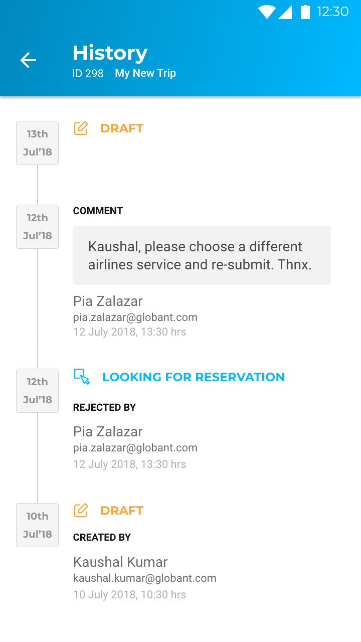
- Comments Section
- History Section
In this phase, the focus of activities continued on the mobile app. The following changes were brought in:
- New navigation patterns
- Notifications improvements
- Comments Section
- History Section
The information architecture for Phase 3.
The information architecture for Phase 3.
Process Focus
Wireframes


Wireframes


High fidelity wireframes


High fidelity wireframes


Organisation: Globant India Pvt. Ltd.
Tools: Adobe XD, Figma
Timeline: Nov 2017 to Dec 2018
Organisation: Globant India Pvt. Ltd.
Tools: Adobe XD, Figma
Timeline: Nov 2017 to Dec 2018
Travel • UX UI Design


